Retrospective studio notes · November 1, 2026, with a November 2 update.
Digital preview — CDW Next34 terrain study. The featured image is a later PNG export, not a photograph of the physical plot.
November 1: The preview experiment
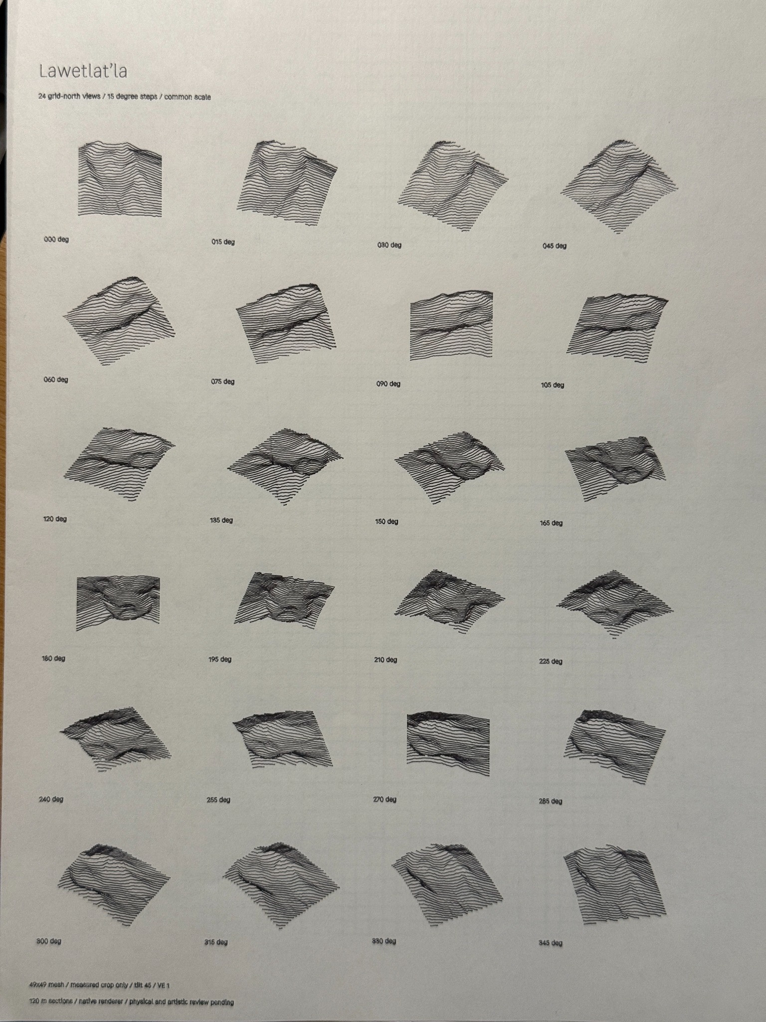
After plotting 24 views of Lawetlat’la in CDW Next31, I’ve been experimenting with a black paper background and manually inverted pen colors. I saved a sample called “Light experiement black paper.”
This is a preview experiment. One question is what each color represents. I wondered whether yellow was the shade, but the pen-to-terrain assignments still need checking.
A new project also starts with two black pens, the second disabled. Bringing in terrain pens leaves that spare behind. I’ve asked whether we can remove the unnecessary default and introduce Standard and Inverse terrain palettes, rather than changing every color by hand.
Lighting is another part of the experiment. Could a directional sphere make the light easier to adjust, in the way the existing cube helps with orbit and tilt?
November 3 update: The light-direction sphere is now in place. A new moving-light study holds the terrain and camera still to show what changes as the light travels around it.
I’m also finding that I want tighter foreground and background lines. For the sky, I’d like to explore clouds, patterns, and gradients made with a single pen color. Changing spacing and angle at the beginning, midpoint, and end could vary the tone without changing the ink.
These requests lead to a larger question: how can CDW handle more geometry? Would rendering features in stages help? Could another rendering approach, or an open-source tool such as vpype, contribute? Those questions are now being investigated; they are not completed features or measured improvements.
I’d like these notes to work like a stand-up critique in painting class: show the work, talk about what succeeds and what needs changing, then return to it after trying something new. For this experiment, the next comparison is still ahead.
Update: I’ve now tried the Inverse terrain palette in Next32, and it works well for this experiment. The other questions remain under review.
November 2: When the paper is the dark tone
What happens when the paper supplies the darkest value? For this terrain experiment, I plotted the shade pass with a single pen on black sketchbook paper. The light marks have to do a different job than dark ink on a light sheet: the paper remains visible as part of the drawing, while the lines describe the ridges and the transitions around them.
The broken foreground strokes and fine contours make the terrain readable without filling every shadow. The diagonal lines around the peaks add another direction to the composition. It is useful to see this as an actual drawing rather than only a screen preview: the page, the pen and the movement of the machine all become part of the result.
The sheet was still in a sketchbook, so the surface had some height variation. Even so, the plot came out reasonably well. That is an observation about this particular test, not a general guarantee that an uneven surface will plot consistently.
I also exported a digital plot image of the light-on-dark design. That gives me another way to share the image, but I want to keep the distinction clear: a PNG is a preview of the design, while a pen plot is a physical object with its own paper and marks. Seeing them together makes it easier to ask what survives the trip from screen to sheet.
The next question is how far a single ink and the black of the paper can go before the drawing needs another value or a different kind of mark.